About Invest
Invest is an established mutual fund transaction platform used by advisors and investors across India. That scale changed how I looked at the problem. This wasn’t a small product where a few usability issues affected a handful of users. A small amount of friction in the transaction flow could repeat across millions of investors and thousands of advisors.
- 10M+Investors
Investors on the platform at the time of the project.
- 10KFinancial advisors
Advisors running their practice on Invest.
- ₹7K–15K CrAssets under management
Roughly ₹150 Cr in monthly transaction value.
- 30–35%Share of India’s MF volume
Internal estimate of India’s mutual fund transaction volume.
What I Did
Why the Transaction Flow Mattered
Invest’s business depended on both advisor SaaS fees and transaction-driven commissions. So when a transaction failed or a user dropped out, the impact went beyond UX. It could mean lost commission for the advisor, slower AUM growth, another support ticket, and lower confidence in the platform.
The project started after three things began happening together: transaction completion had plateaued, advisor complaints were increasing, and support teams were spending too much time helping investors complete routine transactions.
- How might we make routine mutual fund transactions easy enough to complete without an advisor or support agent stepping in?
- How might we surface the constraints that cause failed transactions before the investor hits “Place Order”?
Goals
The goal wasn’t simply to make the UI look cleaner. The broader objective was to make routine transactions easier to complete without assistance.
My Role
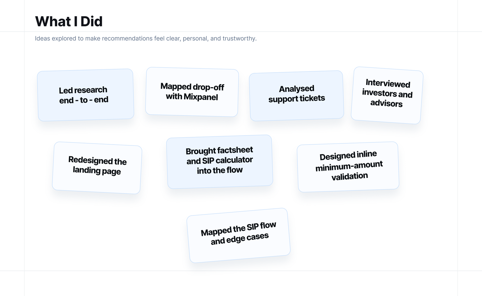
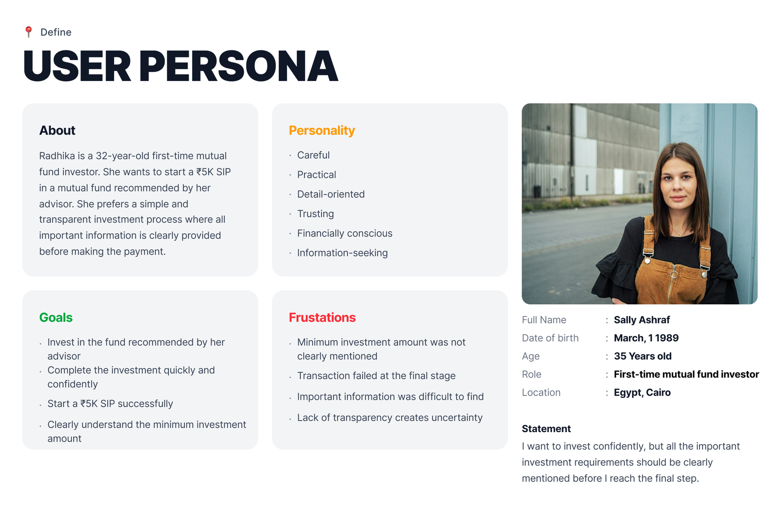
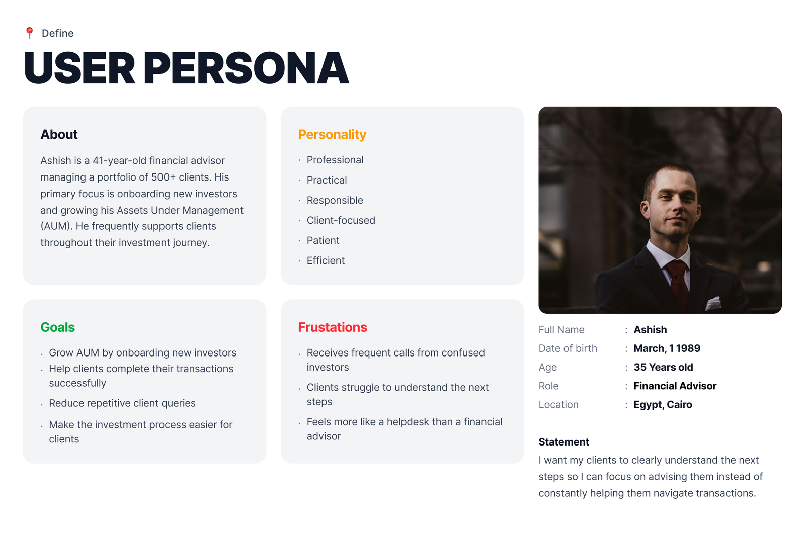
I led the research and design work end-to-end as an individual contributor. I worked closely with the Product Manager on scope and prioritisation, the Business Analyst on requirements and data, and engineering on feasibility and implementation. The support team became an important research source, while advisors and investors participated in the research.
Research Approach
The project started with a simple question: why were users dropping out of transactions that should have been routine? There wasn’t a dedicated researcher on the project, so research was embedded directly into the product-design cycle.
Research questions
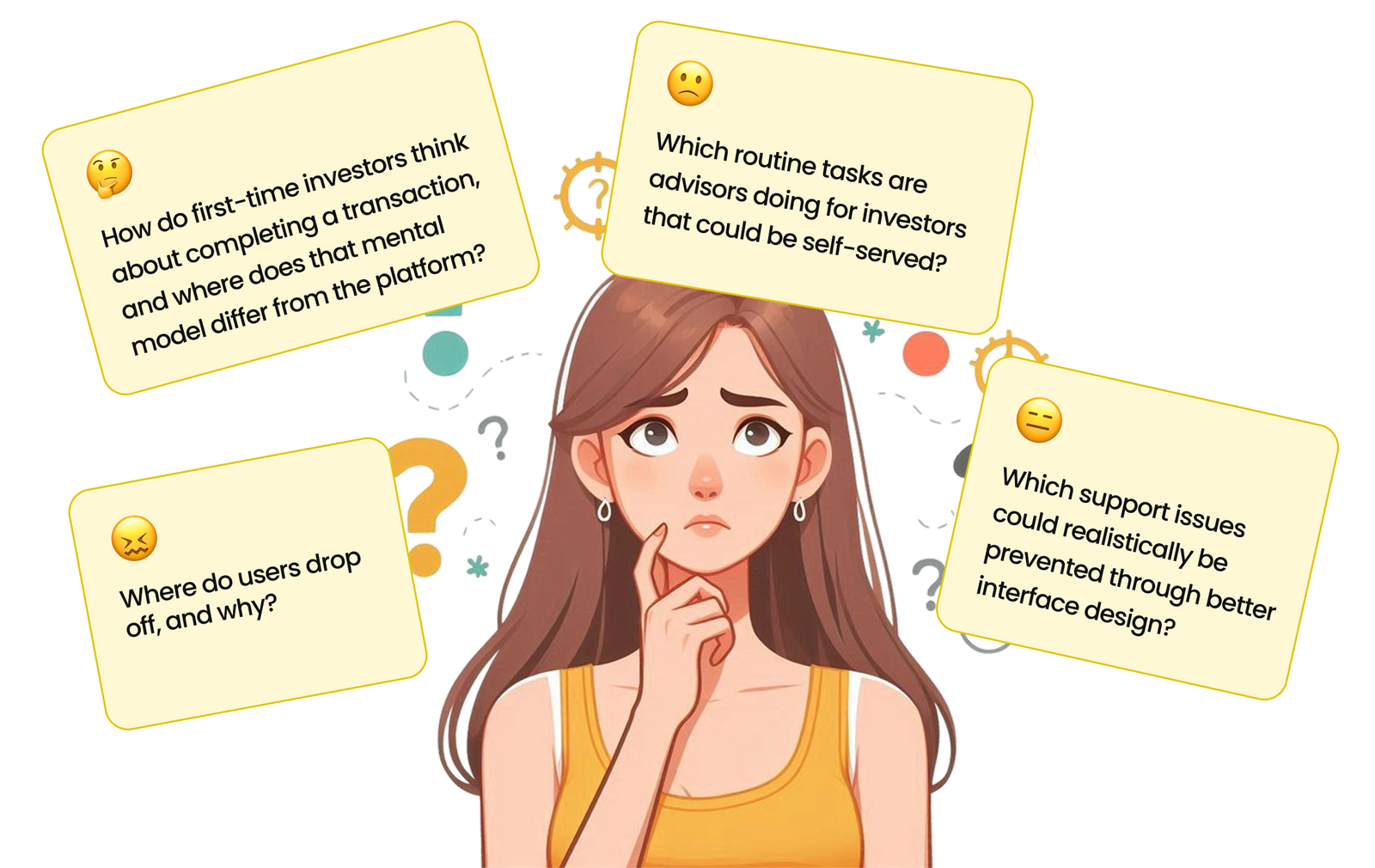
- Where do users drop off, and why?
- How do first-time investors think about completing a transaction, and where does that mental model differ from the platform?
- Which routine tasks are advisors doing for investors that could be self-served?
- Which support issues could realistically be prevented through better interface design?
I started with a few hypotheses, but I deliberately treated them as things to test rather than assumptions to prove.
Methods
I used a mixed-method approach. Interviews helped me understand the “why”, while Mixpanel and support-ticket data helped me understand where the problems were happening and how often.
- Investor interviews helped uncover mental models, hesitation, and moments of confusion.
- Advisor interviews showed which parts of the process were taking up advisor time.
- Support-ticket analysis showed recurring problems in users’ own language.
- Sitting with support agents helped me understand the questions they were answering every day.
Participants
- 5–6 investors
- 5–6 advisors
- Support-agent observations
- 7–8 usability-test participants
Investors included first-time and experienced users, while advisors represented different client-base sizes.
Insights & Synthesis
When I looked across the interviews and support-ticket data together, five patterns stood out. Each one pointed to a gap between what users expected at a particular moment and what the product actually asked them to do.
1. The invisible constraint
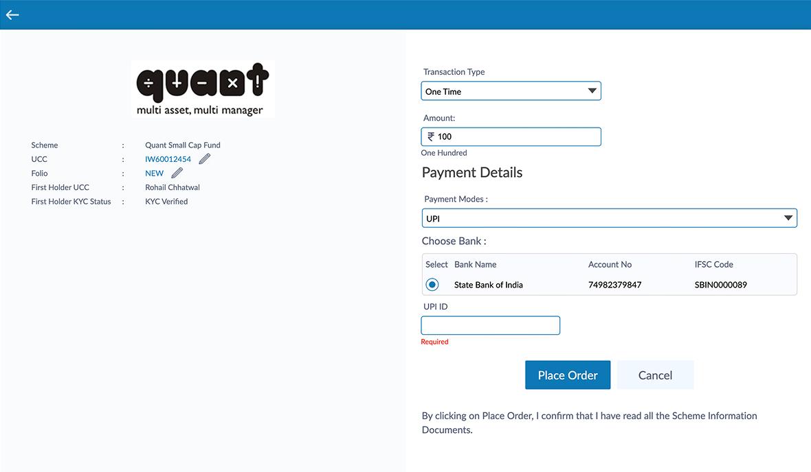
First-time investors often reached “Place Order” thinking they were ready to invest. The problem was that an important constraint—the minimum investment amount—was sometimes only surfaced after they had already entered an amount and tried to continue.
2. There were two kinds of advisor dependency
Advisors weren’t asking to disappear from the transaction experience. What frustrated them was spending time explaining mechanical steps such as where to click or how much to enter.
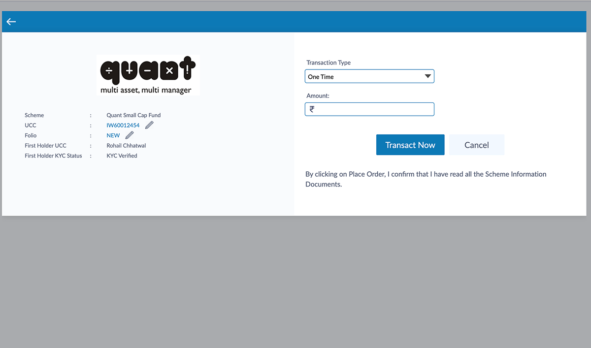
3. Findability wasn’t the real problem. Usability was.
Users could find the filters. They even opened them. The problem was that the filter interface was difficult to use once open.
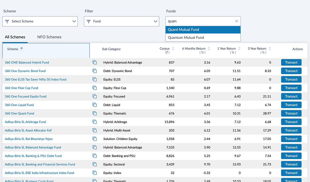
4. Context switching was hurting confidence
Investors often wanted to check fund information before committing. In the old experience, clicking “Factsheet” took them away from the transaction.
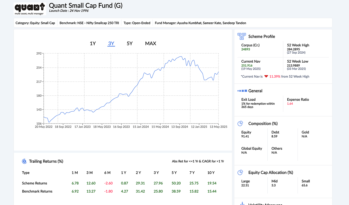
5. For first-time investors, curated beat comprehensive
Experienced investors could work through a large fund universe. First-time investors often weren’t trying to find the perfect fund; they were looking for a reasonable place to start.
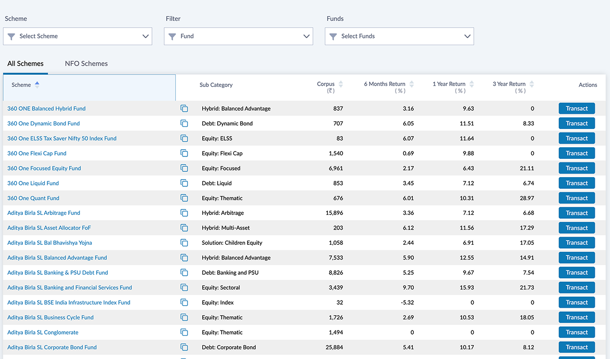
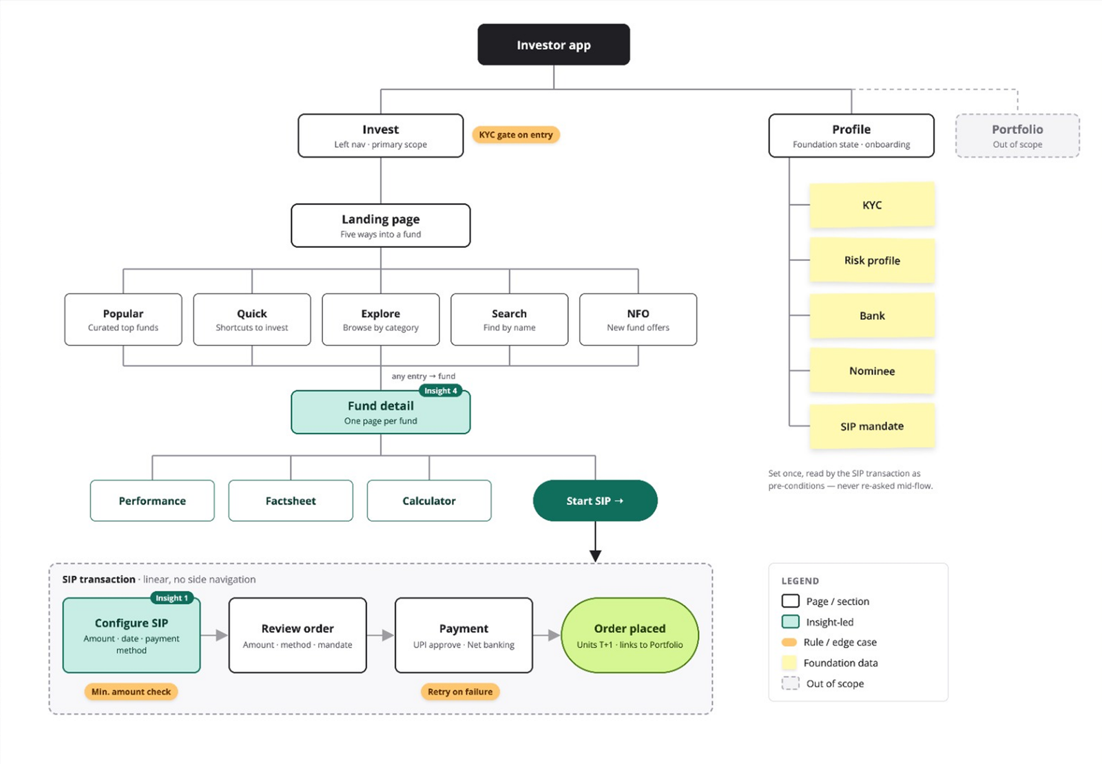
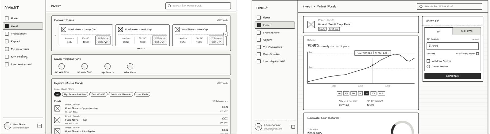
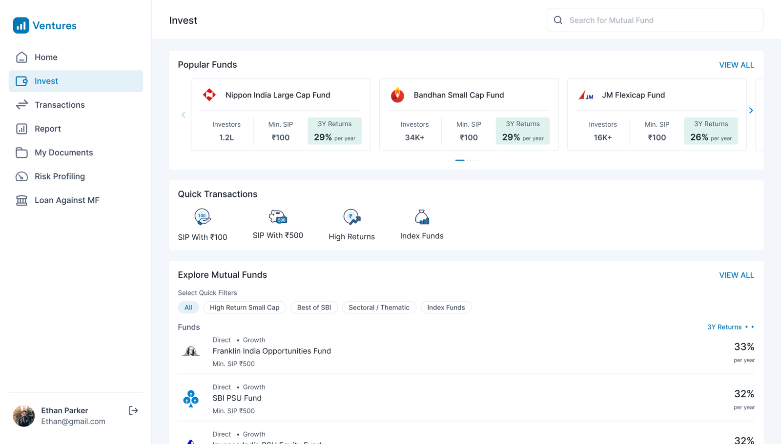
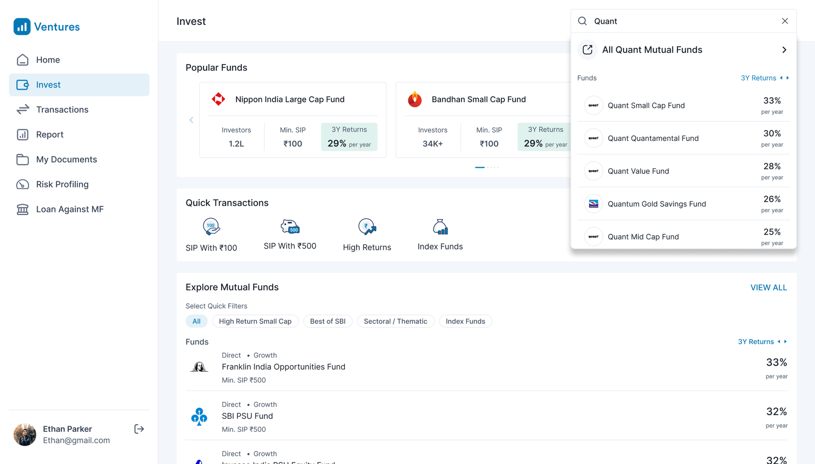
I structured the landing page around three levels of confidence: Popular Funds, Quick Transactions and Explore Mutual Funds. The idea was simple: give users an easy starting point if they weren’t sure what to search for, while still keeping the full universe available.
Problem Identification
Five ways in, one way through
Information architecture · Invest → SIP
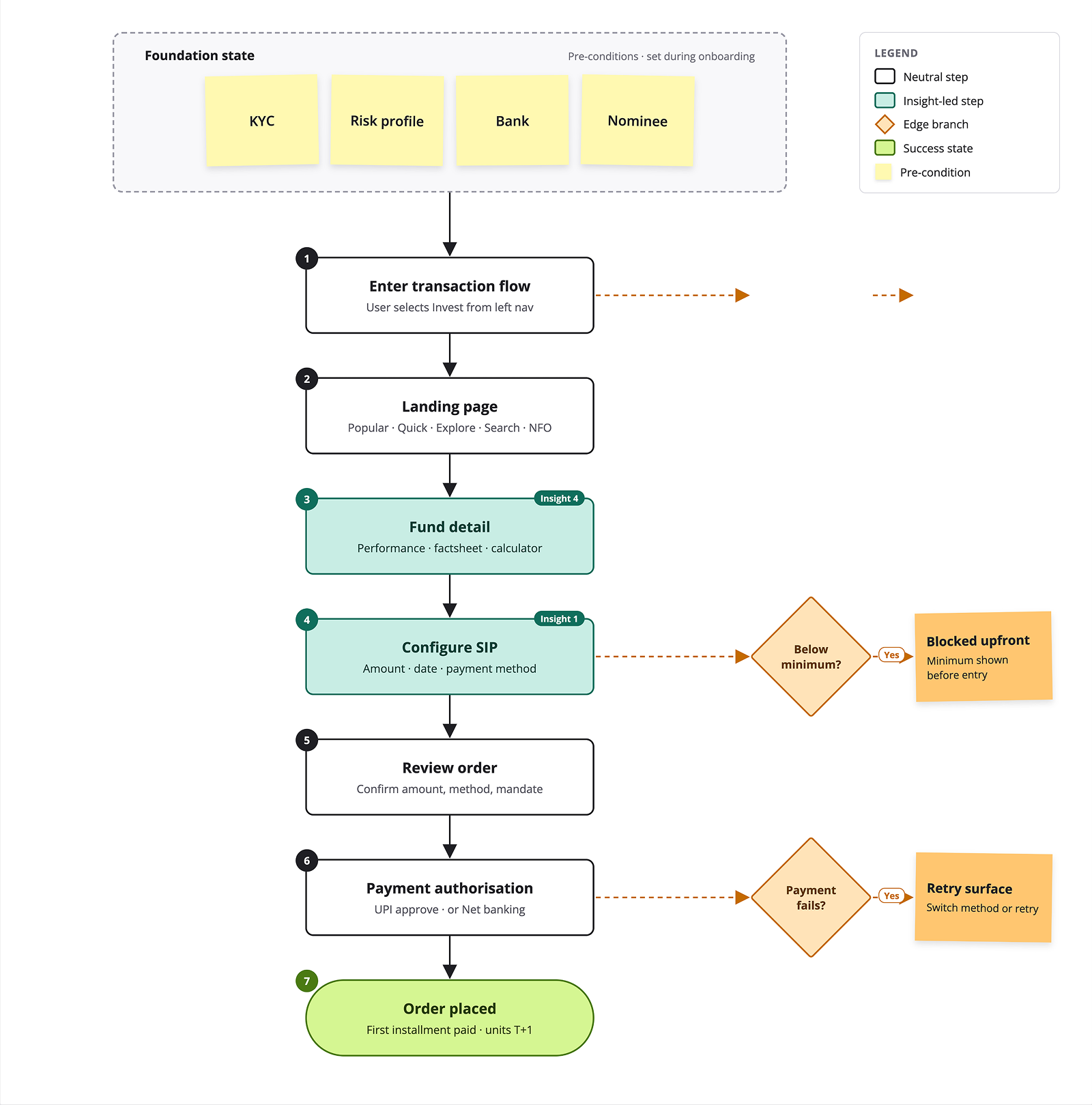
Primary SIP Flow
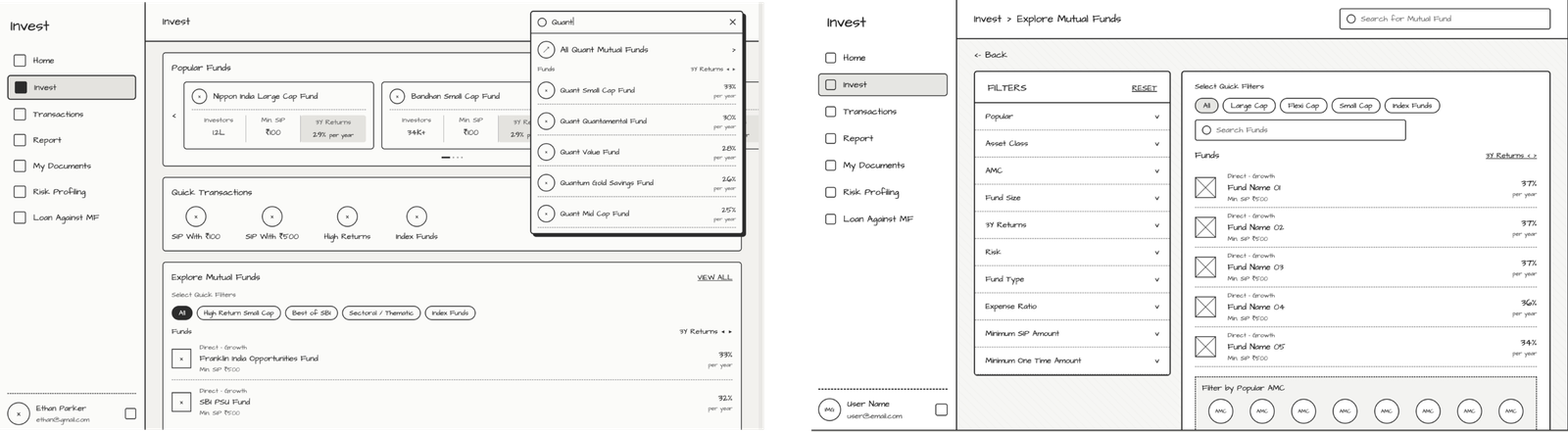
Wireframes
Design Process
Decision 1 — Landing page structure
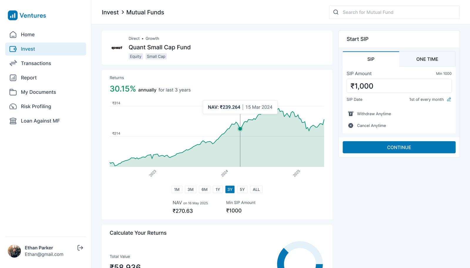
Decision 2 — Bringing the factsheet and SIP calculator into the flow
I decided to keep the important verification information directly in the workspace. The user could review the fund, understand its performance and use the calculator without losing their place in the transaction.
Decision 3 — Making the minimum amount visible at the point of entry
I placed that information directly in the amount input rather than using a separate badge, tooltip or label. This put the constraint exactly where the user’s attention was when entering the amount. Inline validation then prevented below-minimum amounts from becoming failed transactions.
Decision 4 — Quick Transaction shortcuts
I used fixed shortcuts based on what first-time investors were actually transacting in. Personalisation could be explored later for returning users.
Decision 5 — Filter interaction
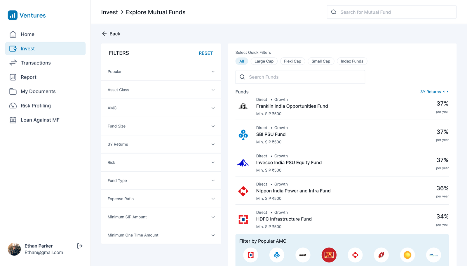
I considered filters that would appear progressively as users scrolled. I rejected that approach because the research suggested that users needed help understanding what they could filter by in the first place.
Instead, I surfaced common categories as quick-filter chips—Large Cap, Flexi Cap, Small Cap and Index—and kept an Advanced Filter panel for users who needed more control.
Important edge cases
- If KYC has lapsed, the user is redirected to resolve it.
- If the amount is below the minimum, the transaction is blocked before submission.
- If payment fails, the user gets a recovery path rather than a dead-end error.
- Large Cap
- Flexi Cap
- Small Cap
- Index
- Advanced Filter
The core SIP journey can be represented as seven steps, with the important preconditions and failure branches shown alongside it.
Foundation state: KYC, risk profile, bank, nominee and SIP mandate are already set during onboarding.
- Enter the transaction flow — user selects Invest from the left navigation.
- Landing page — Popular, Quick, Explore, Search and NFO.
- Fund detail — performance, inline factsheet and SIP calculator.
- Configure SIP — amount, date and payment method.
- Order review — confirm amount, method and mandate.
- Payment authorisation — UPI approval or net banking.
- Order placed — first installment paid; units expected at T+1.
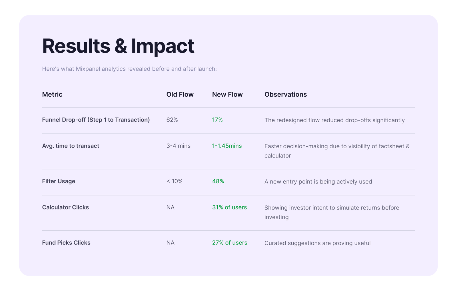
Designing out the drop-off