
SIP and Lumpsum Calculator
1. Project Overview
Problem Statement: Investors often face challenges in tracking the performance of their investments through SIP Lumpsum tools. While basic functionality exists for investment tracking, there was a need for a more user-friendly interface that allows seamless input, clear visual representation of investment growth, and easy export options to share reports.
Objective: The goal of this project was to streamline the user experience for managing and tracking SIP and Lumpsum investments. We aimed to enhance user engagement by implementing intuitive input fields, improving performance visualization with graphs and tables, and allowing for smooth PDF export of investment reports.
2. Research
User Research: To inform our design decisions, we conducted a combination of user interviews and surveys targeting investors who use SIP and Lumpsum investment tools. Key findings included:
- Need for clarity in performance tracking: Users wanted simple, visually engaging graphs to track their investment growth over time.
- Preference for simplicity in inputs: Complex forms with multiple steps discouraged users from completing their investment setups, highlighting the need for a more streamlined process.
- Need for export functionality: Users required an option to export their data in a PDF format, especially to present investment details to clients.
Competitive Analysis: We also evaluated competitors’ platforms and their visualization capabilities. While most tools displayed basic performance graphs, few offered intuitive customization for export options or comprehensive data on both source and target schemes.
3. Design Process
Information Architecture: We structured the input fields for SIP and Lumpsum investments to ensure users could easily input key details (e.g., amount, investment period, rate of return, frequency). The outputs were carefully organized into:
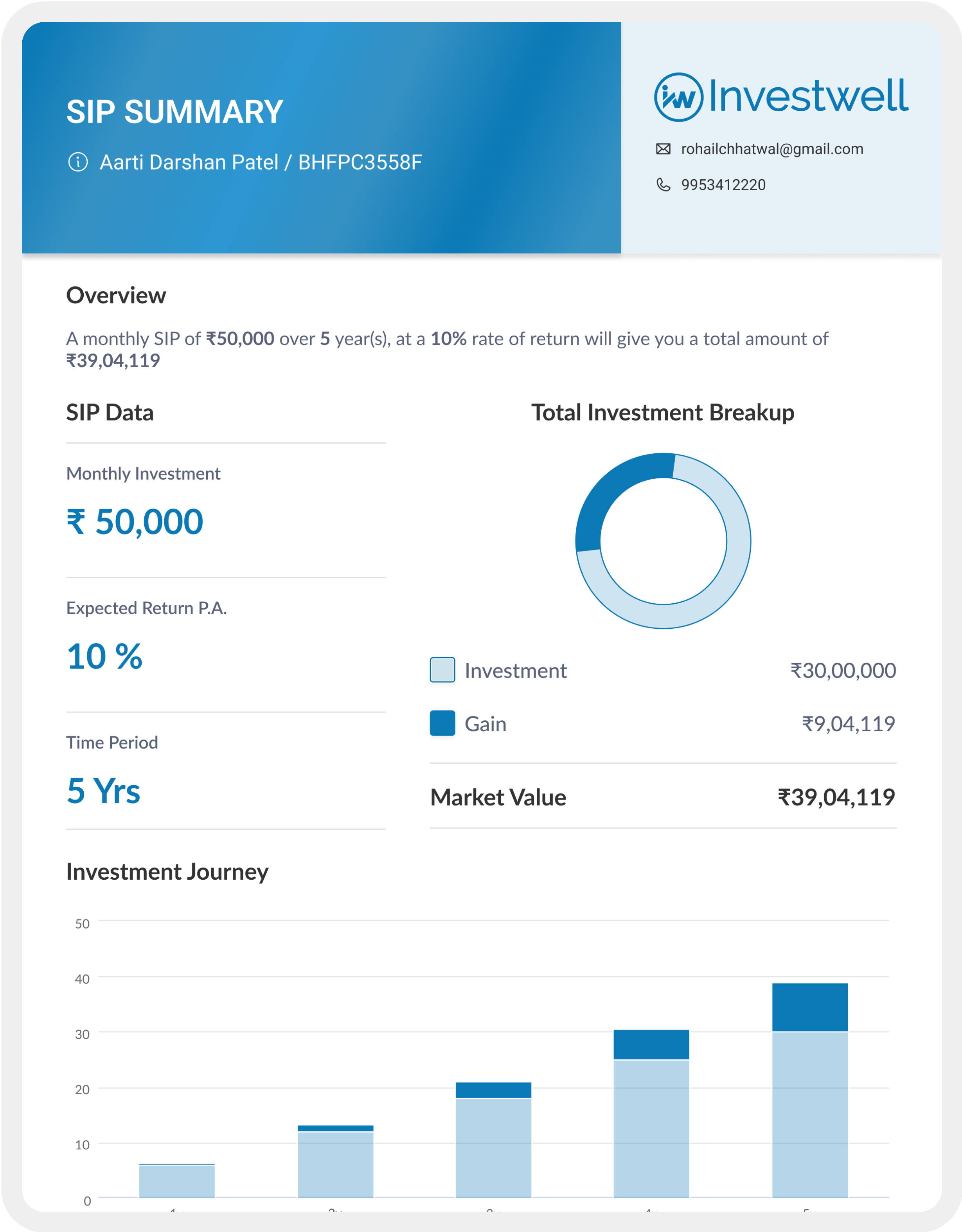
- Graphs for visual tracking of growth.
- Tables to show year-on-year or installment-wise investment details (e.g., balance, gain, total amount).
Wireframes & Prototypes: Initial wireframes focused on clarity, ensuring each section (input fields, graph, table, export) was easily distinguishable. Prototypes were built using tools like Figma and tested internally for flow. Interactive components, such as dropdowns for frequency and source/target scheme names, were incorporated.
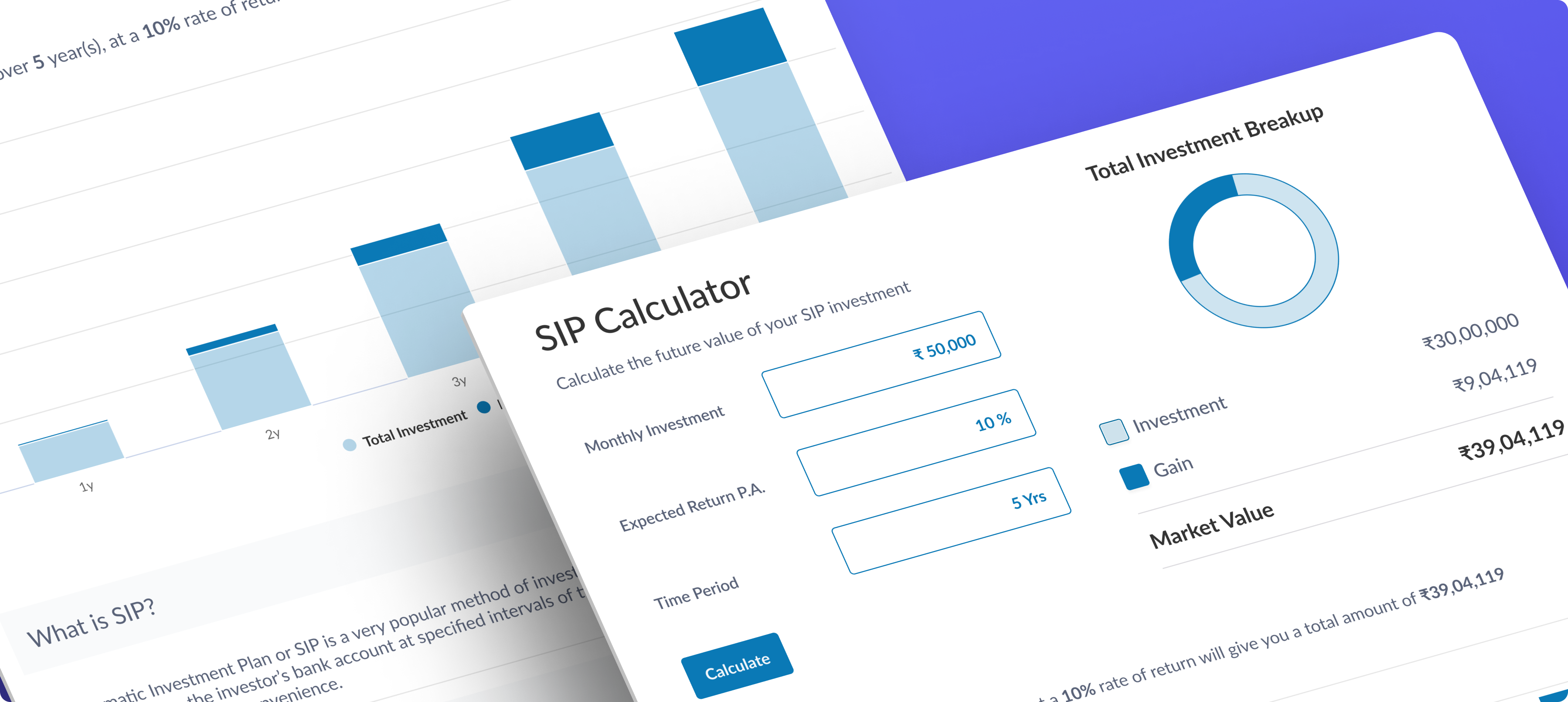
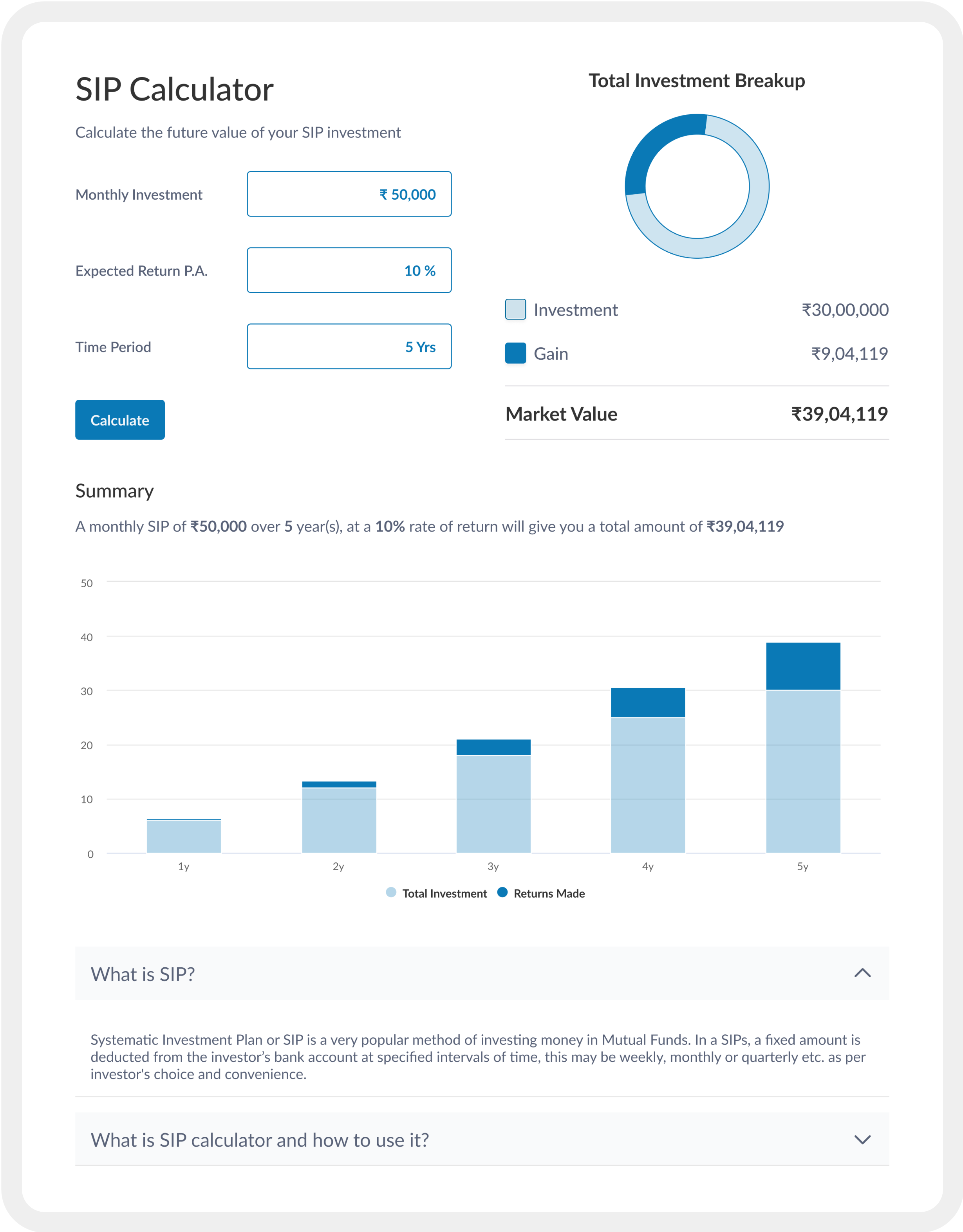
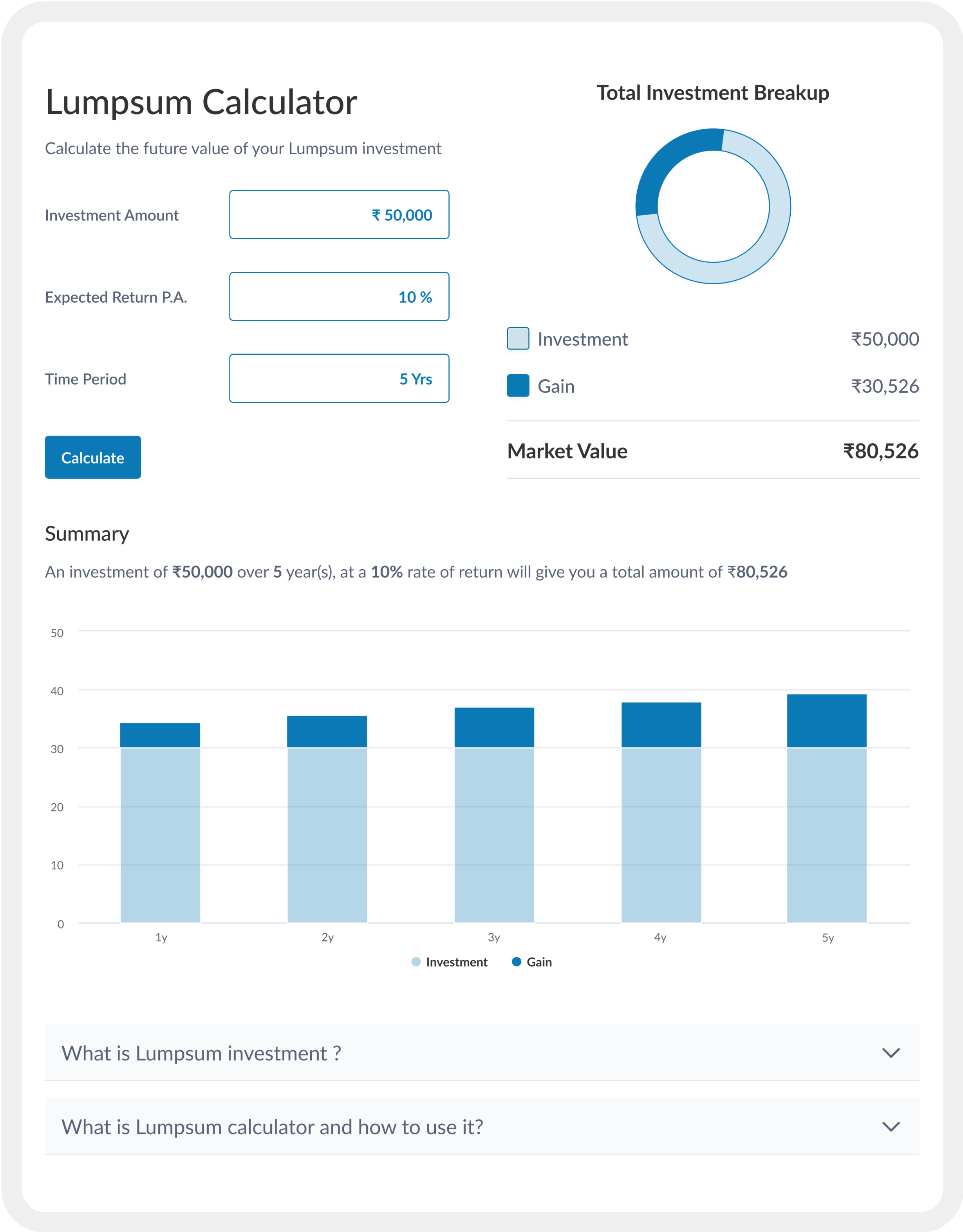
Graph Design: We designed line graphs for SIP and bar graphs for SIP and Lumpsum to visually highlight growth trends. Consistent colors and tooltips were used for better readability. For example, the SIP graph used a green gradient to signify investment growth, while the STP graph featured dual-color bars to distinguish between source and target schemes.
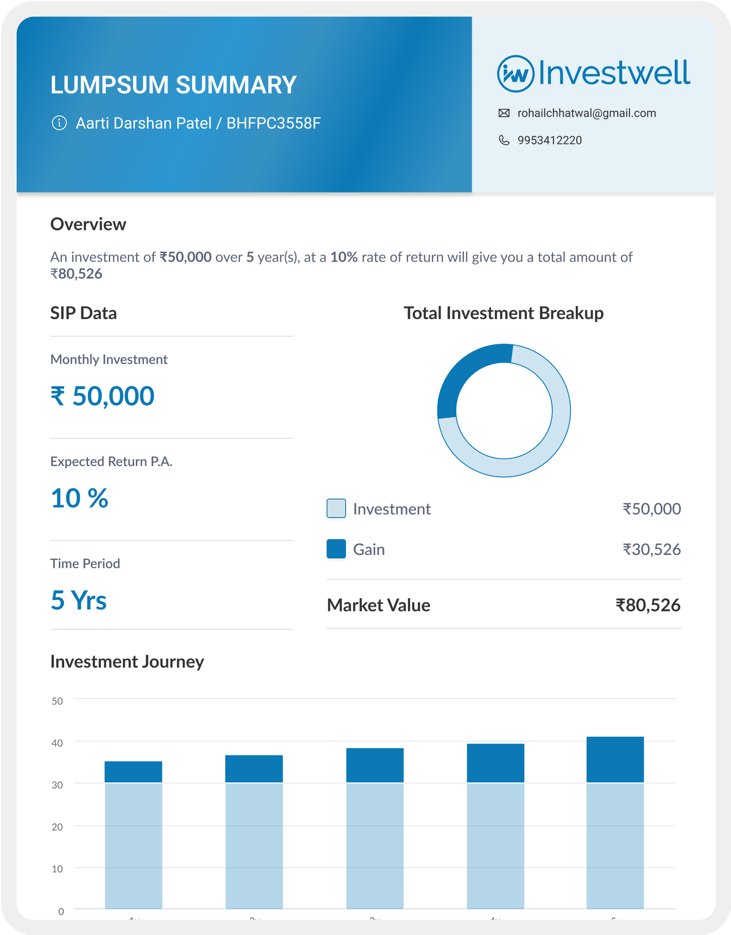
Export Feature: The export functionality was integrated directly with the on-screen outputs. Before generating a PDF, the system prompted users to enter client names and scheme details. We ensured that data consistency was maintained between the onscreen outputs and the exported PDFs.
4. User Testing & Iteration
Usability Testing: We conducted usability tests with real investors who used the platform in a simulated environment. The primary goal was to ensure that users could:
- Input data quickly and correctly.
- Navigate between different investment types (SIP Lumpsum) with minimal confusion.
- Understand and interpret performance data without needing expert knowledge.
Feedback & Iteration: Key feedback:
- Clarity: Users appreciated the simplicity of the frequency dropdown but requested more specific options for customizing the number of installments.
- Export Consistency: While the design was generally well-received, some users noted that scheme names should be more prominently displayed in both the graph and table in the PDF.
Final Changes: Based on this feedback, we added clearer labels in the export and ensured that the frequency and installment options were better aligned with user expectations.
5. Solution
Final Design: The final design focused on simplicity and ease of navigation. Key features included:
- SIP investment tracking with real-time graphs: These were designed to make it easy for users to visualize growth.
- Detailed tables: Showing year-on-year or installment-wise breakdowns of invested amounts, gains, and balances.
- PDF Export: Users could generate a PDF that mirrored the onscreen data, with additional custom fields for prospective client names and scheme details. This ensured consistency and met the needs for reporting and sharing investment data.
- Accessibility: We used high-contrast color schemes for better readability and ensured the design was mobile-responsive for users accessing the tool on different devices.
6. Impact
Results: After the launch, the platform saw a 20% increase in user engagement, with more users actively tracking their investments through SIP and lumpsum tools. Feedback indicated that users felt more confident in their investment decisions due to the clarity of the performance graphs and tables.
The PDF export feature was highly appreciated by 80% of the users, who used it to create reports for clients or for personal tracking.
A reduction in user errors was noted, particularly in investment calculations, as the system validated inputs in real time, ensuring that installment amounts did not exceed the available balance.