About Mint Copilot
MintGPT is a conversational AI assistant inside Mint, Investwell’s software for mutual fund distributors. It allows advisors to ask questions in plain English instead of navigating through multiple tools and screens.
MintGPT understands each question and routes it to one of four specialized agents: portfolio for client holdings, returns, allocation, and capital gains; bops for SIPs, AUM, and business trends; crm for meetings, leads, and risk profiles; and research for fund performance and screening.
The MVP focuses on read-only answers through the web experience, with actions, mobile, voice, and alerts planned for later stages. The launch follows an internal alpha, 10-user beta, and general availability, followed by actions and expanded bops capabilities.
MintGPT uses a monthly token allowance per broker, with top-ups available when the allowance is exhausted. Its core value is speed: Mint already contains the required data, while MintGPT turns a 3-minute, multi-screen lookup into a simple 10-second question.
What I Did
- Researched the advisor's workflow
- Mapped journeys and pain points
- Designed the conversational experience
- Designed for trust and clarity
- Made usage visible
My Role
As the Product Designer for MintGPT, I owned the end-to-end design process, from understanding advisor workflows and framing the problem to designing and validating the conversational experience.
My responsibilities included user research, problem framing, UX and interaction design, and high-fidelity UI design across the home, typing, thinking, and response states. I also structured AI responses using a Summary → Data Table → Key Insights format to make information easy to scan.
I focused on building trust through transparent token usage, clear loading and stop states, and AI disclaimers, while collaborating closely with the Product Manager and engineering team to balance the ideal experience with MVP constraints.
Insights & Synthesis
I synthesized research findings from advisor interviews, workflow observations, support tickets, and industry research by grouping recurring patterns into themes using affinity mapping. I then translated each theme into a clear insight and corresponding design decision.
Insight 1: The data exists, but reaching it is the problem
Advisors already had access to the information they needed, but they were losing valuable time navigating across four different tools, each with its own login, layout, and filtering system.
Insight 2: Advisors need answers during the conversation, not after
The highest-pressure moment is during a live client call, when advisors need quick and accurate answers. Without instant access to the right information, they often have to say “I’ll get back to you,” delaying action and creating a less seamless client experience.
Insight 3: Advisors don't know what to ask an AI
Most advisors had already tried general AI tools, but they were unsure what they could ask about their own data. A blank input field created hesitation, making it difficult for them to understand what MintGPT could do for them.
Insight 4: Trust is fragile with financial data
Accuracy is critical because sharing an incorrect number with a client can undermine an advisor’s credibility. Advisors wanted transparency into where answers came from, along with clear indications of when the AI might be uncertain or wrong.
Insight 5: Advisors scan, they don't read
Advisors typically look for the key number first and then review the supporting explanation. Long paragraphs slowed them down, making it harder to quickly find the information they needed during client conversations.
Insight 6: Usage-based pricing creates anxiety
With a token-based usage limit, advisors were concerned about running out unexpectedly or wasting tokens on poorly phrased queries. They needed clear visibility into their remaining balance and usage.
User Problem
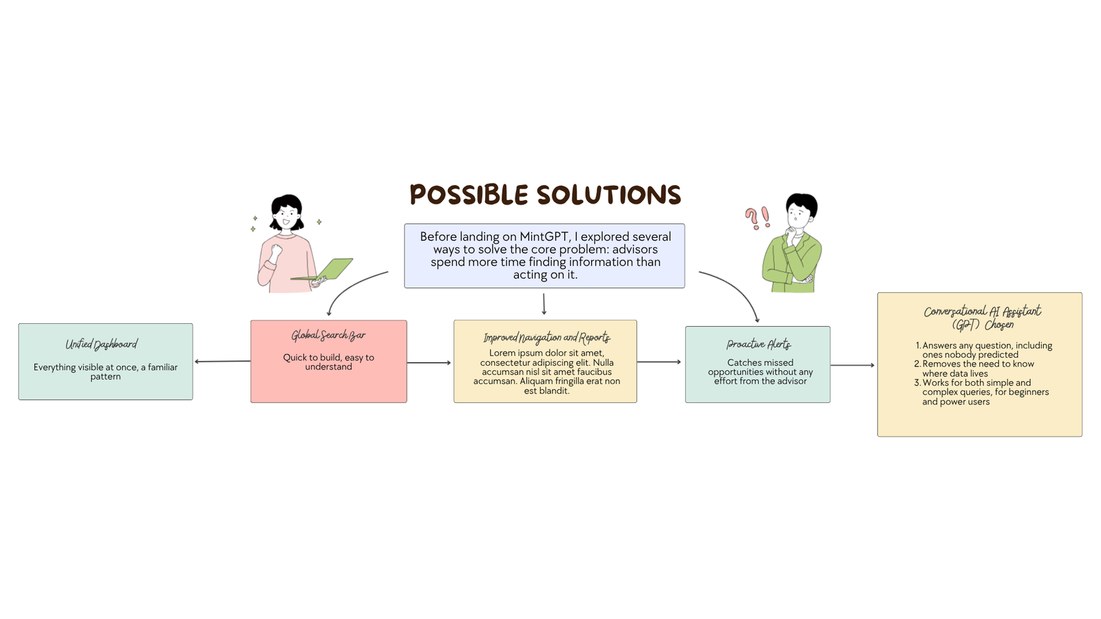
Advisors have all the data they need, but it is scattered across too many tools. To prepare for a single client call, they often switch between the portfolio system, CRM, back-office dashboard, and research terminal, each with different logins, layouts, and filters.
This constant context-switching makes simple questions time-consuming, slows down answers during client conversations, and can cause opportunities such as failed SIPs, pending risk profiles, and cold leads to go unnoticed. Advisors also carry a high mental load because they need to remember where each piece of information lives and how to find it.
The goal was to give advisors instant, trustworthy answers from all their data in one place, allowing them to spend less time finding information and more time acting on it.
Possible Solutions
How Might We
Primary
- How might we give advisors instant, trustworthy answers from all their data in one place, just by asking?
Supporting
- Access: How might we let advisors get answers without knowing which tool or screen holds the data?
- Speed: How might we help advisors answer client questions confidently while still on the call?
- Trust: How might we make AI-generated answers feel accurate and verifiable enough to share with clients?
- Clarity: How might we present complex financial data so it's scannable at a glance?
- Discovery: How might we help first-time users learn what they can ask?
- Ambiguity: How might we handle vague questions without making advisors feel the system failed?
- Opportunities: How might we surface failed SIPs, pending tasks and cold leads before they turn into lost revenue?
- Usage: How might we make token usage visible so advisors are never cut off mid-task?
Design Goal
Make MintGPT the fastest, most trustworthy way for advisors to get answers from their data in one place, simply by asking.
Process
I followed a Double Diamond approach, starting with broad research to understand the advisor’s world, narrowing the findings into a clear problem, then exploring multiple solutions before refining the final experience.
The process began with interviews, workflow shadowing, analytics, support-ticket reviews, and competitive research to understand how advisors prepare for client calls and navigate multiple tools. These findings were synthesized into personas, user journeys, problem statements, and design goals.
For the solution, I explored different ways MintGPT could live within Mint, including a side panel, full-page experience, contextual triggers, @ mentions, / commands, and suggested prompts. I also designed response patterns, conversation flows, clarifying questions, and error states for different agents.
The final experience was brought to life through high-fidelity designs using Mint’s design system, with loading, empty, error, low-token, and trust states such as data sources, timestamps, and feedback. Usability testing with advisors on real tasks helped validate the experience through task success, time to answer, and trust in responses before the closed beta.
Design Solutions
Feature Focus 1: Guided Start with Suggested Prompts
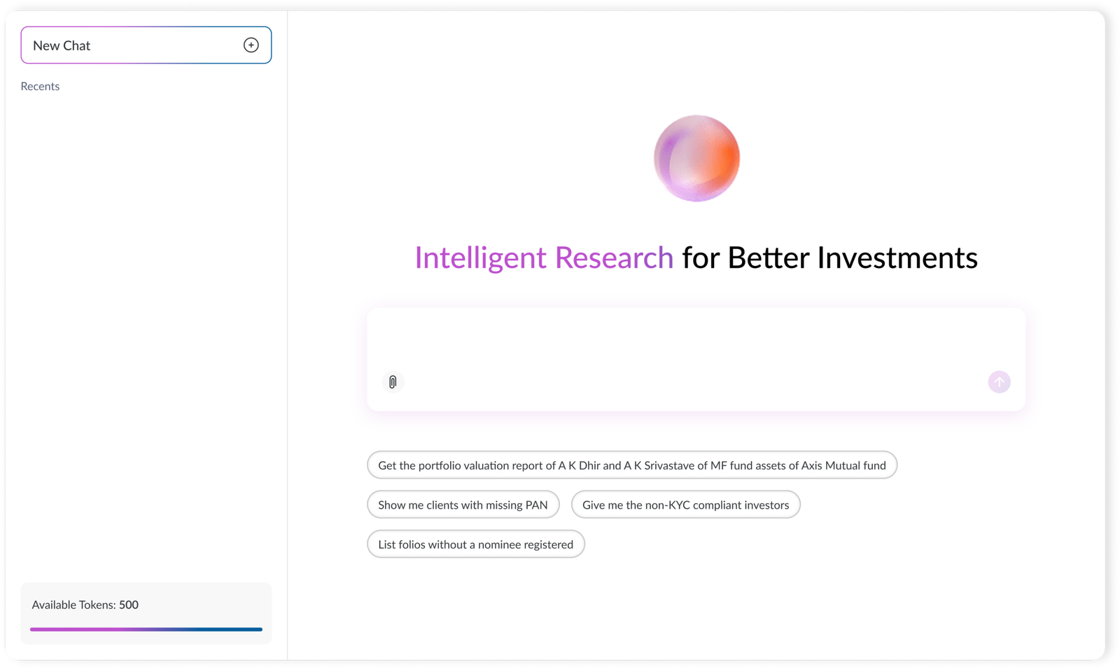
To make MintGPT easy to start, we designed a clean welcome screen with a clear headline, a single input box, and suggested prompt chips that demonstrate what advisors can ask. One click turns a suggested prompt into a full query, helping first-time users understand the product and get value within seconds.
The goal was to eliminate the blank-page problem common in AI tools while keeping the experience simple for beginners and powerful enough for experienced advisors.
Feature Focus 2: Visible Token Meter
Rather than hiding token usage behind the experience, MintGPT keeps an “Available Tokens” card visible in the sidebar with a clear progress bar. The balance updates after each answer, helping advisors understand how much each query costs and how much usage remains.
The goal was to make the usage-based pricing transparent, predictable, and trustworthy, preventing unexpected cut-offs during important tasks.
Feature Focus 3: Natural Language Input
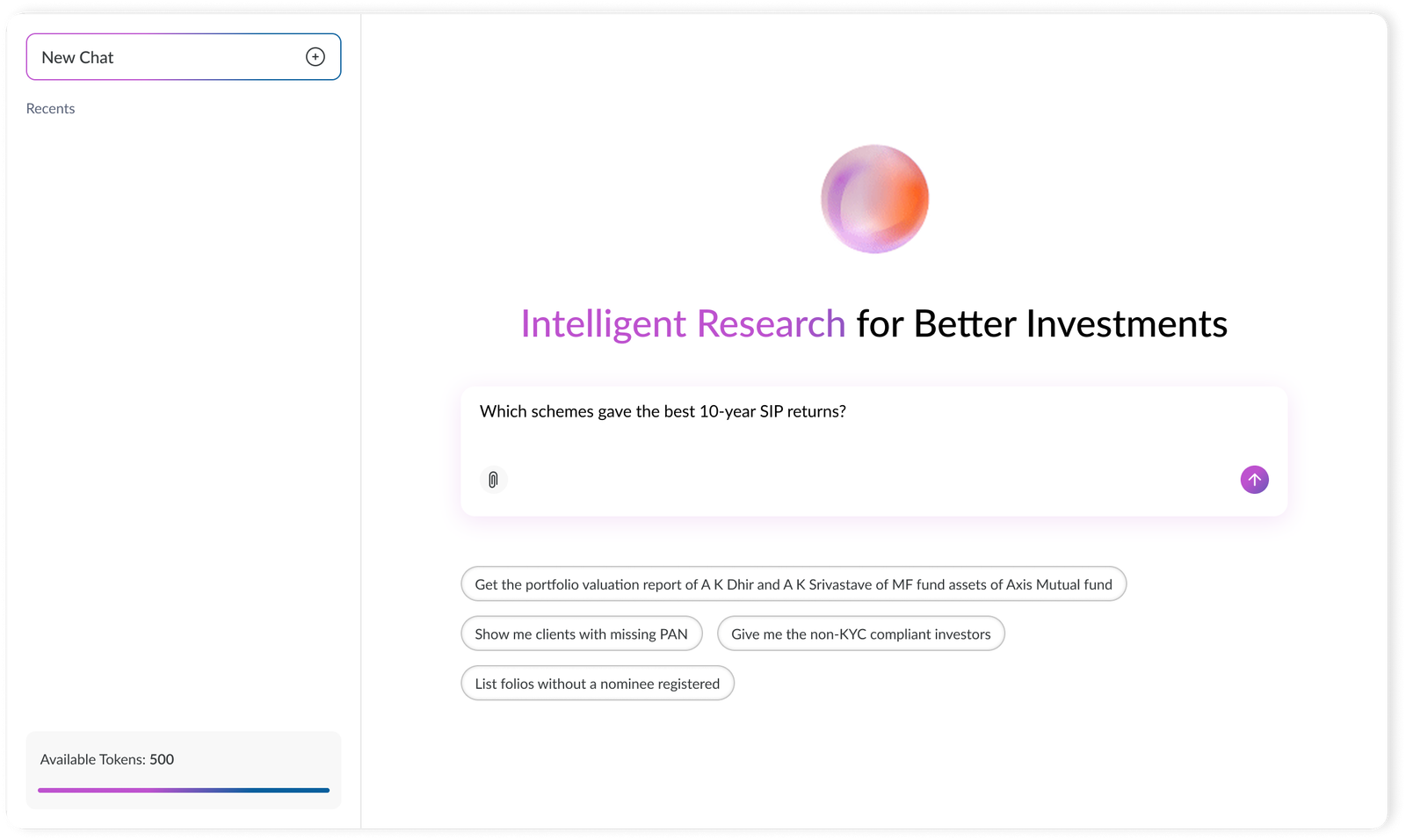
To keep the experience simple and conversational, MintGPT lets advisors ask questions in plain English without navigating filters, dropdowns, or menus. The send button becomes active once text is entered, while an attachment option allows advisors to add supporting files for additional context.
The goal was to make the question itself the interface, giving advisors one focused window to access information across Mint.
Feature Focus 4: Transparent Loading and Control
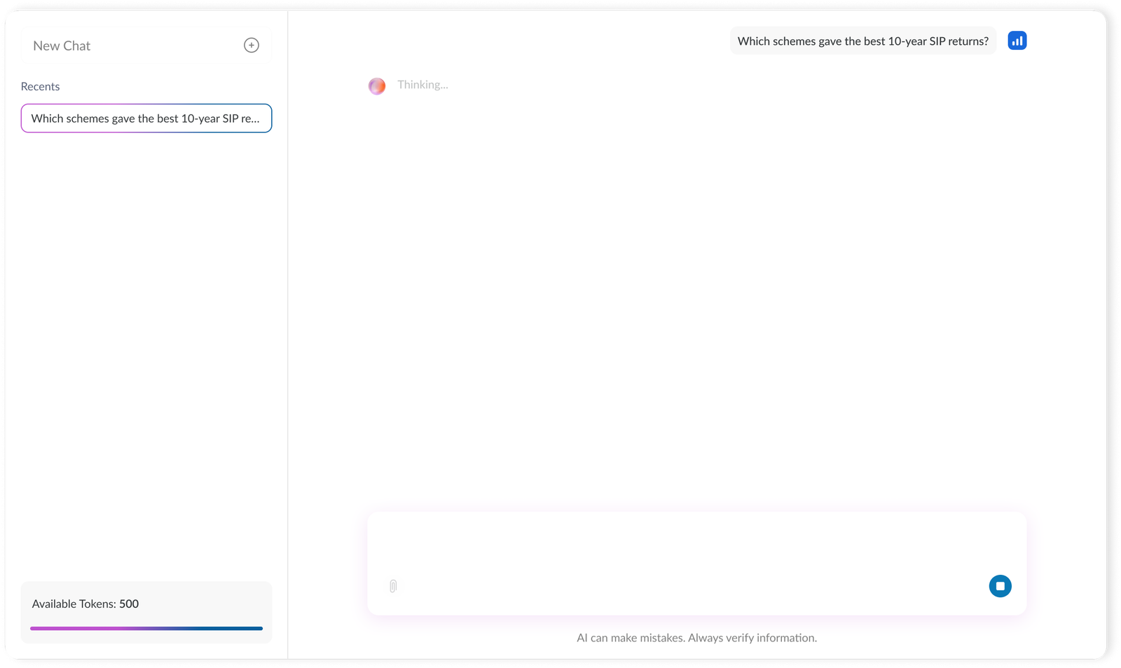
To make the waiting experience feel transparent and controlled, MintGPT uses an animated orb with a “Thinking…” state to show that the system is processing the query. The send button changes into a stop button, allowing advisors to cancel incorrect or slow queries and avoid unnecessary token usage.
A clear disclaimer reminds advisors that AI can make mistakes and information should always be verified. The goal was to build trust through clear feedback, user control, and honest expectations when working with financial data.
Feature Focus 5: Conversation History
To help advisors quickly revisit previous questions, MintGPT automatically saves each query in “Recents,” with the active conversation clearly highlighted. A “New Chat” option at the top allows advisors to start a fresh conversation for each client or task.
The goal was to make frequently needed information easy to find and reduce the need to re-ask questions, helping advisors get answers in seconds instead of minutes.
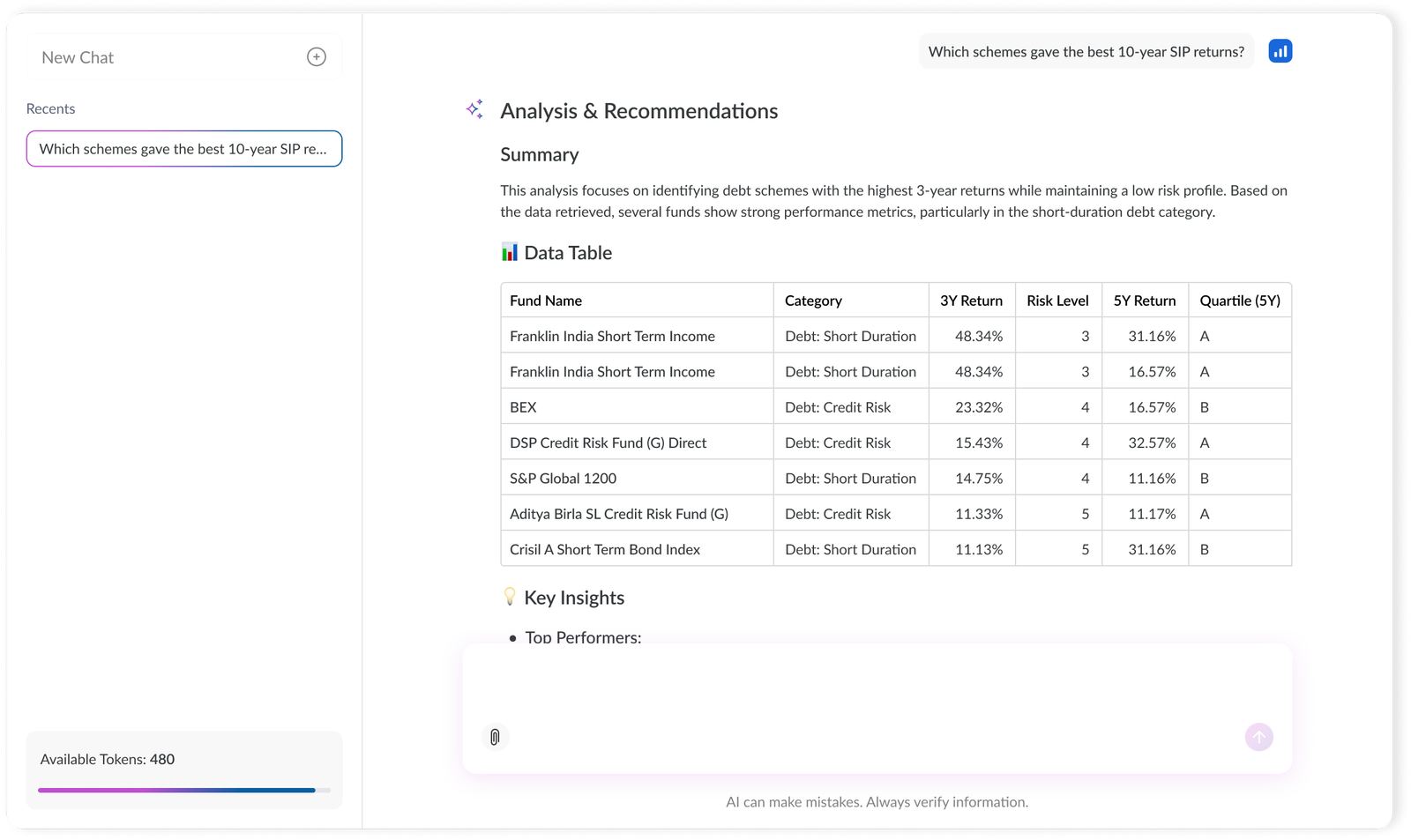
Feature Focus 6: Structured, Scannable Answers
To make responses easy to scan during client calls, every MintGPT answer follows a consistent structure: Summary, Data Table, and Key Insights. The summary provides the main takeaway, the table presents exact numbers, and the insights explain what the data means.
Icons such as 📊 and 💡 help advisors quickly navigate to the section they need, keeping important information visible without overwhelming them with long blocks of text.
Experience Direction
The interface focuses on progressive disclosure, simple comparison patterns, and recommendation logic that explains why each card fits a user.
Impact and result
The redesigned recommendation flow made the decision-making process faster and easier to complete. By splitting the journey into smaller input steps and making the result screen more explainable, users could understand the recommendation without needing to compare every card manually.
Average session time improved from 1:30 mins to 1:00 min. This reduction was important because the product still collected meaningful personalization inputs, but did so in a way that felt lighter and more focused.
Conversion improved from 25% to 47%. The biggest shift came from making the recommendation feel more trustworthy: users could see why a card matched their lifestyle, what return they could expect, and which CTA made sense for that card.
The feature also became an important proof point for the company. It helped communicate the product's value clearly enough to be featured on Shark Tank India, where the company secured the second biggest deal in Shark Tank India history.